
Poster Colours for Beginners: Colour Mixing, Flat Washes, and Light and Dark
Streaks and muddy patches in poster colour usually come from the mix. Learn the right thickness, flat washes, tints and shades, and how to show a round fruit.
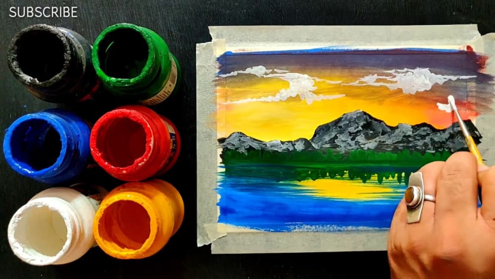
When you paint a small area with poster colour, do you see streaks, with one place dark and another light? Or does the colour underneath mix with the new colour on top and turn muddy?
Most of these problems come from the thinness of the paint (consistency), the wetness of the brush, and not giving the layer underneath enough time to dry. The secret of handling poster colours successfully is not using more paint, but mixing the colour to the right thickness for the job you are doing.
1. The Difference Between Poster Colours and Watercolours
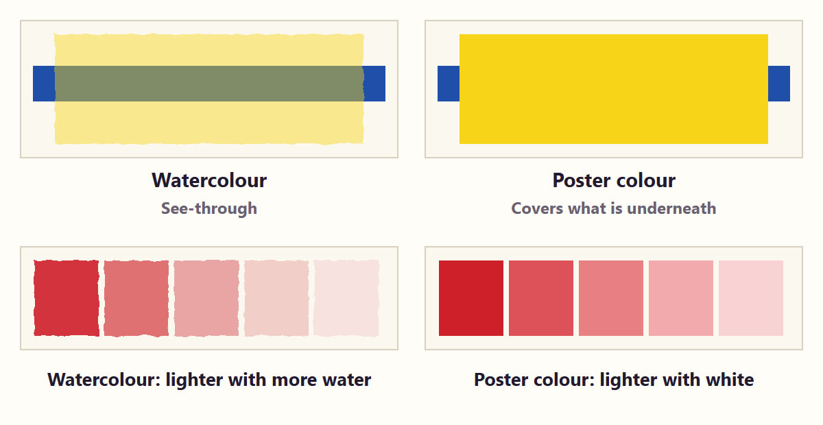
Although poster colours can be dissolved in water, they behave completely differently from transparent watercolours:
- Opaque Coverage: Watercolours tend to be transparent, while poster colours usually give an opaque finish (similar to gouache) that covers the paper or the layer underneath.
- Making Light Colours: In watercolour, you get a light colour by adding more water and letting the white of the paper show through. In poster colour, you make a light colour by mixing in white paint.
A Difference to Remember: Adding white to a colour increases its covering power, and the colour takes on a slightly pale (tint) character. If you add too much water alone, the colour becomes thin and loses its ability to cover.
2. Getting Ready Before You Start
Paper: Cartridge paper or Bristol board (180-250 gsm), a little thicker than ordinary paper and with a smooth surface, is very suitable for poster colours.
Choosing Brushes:
- A flat brush for backgrounds or large flat areas.
- A round brush with a pointed tip for the shapes and details of objects (Round brush, sizes 2, 4, 8).
Palette and Water: Two containers of clean water and a flat white palette.
Cleanliness: Do not put a dirty brush straight into the paint bottle. Use a clean brush or a spoon to take the paint you need onto a separate palette and mix it there.
3. Adding Water Little by Little and the Right Thickness
Take a little paint on the palette and mix in clean water, drop by drop, with a wet brush. The most successful thickness for poster colours is like liquid milk or thick cream (creamy consistency).
Make a brushstroke on a piece of paper to test the thickness:
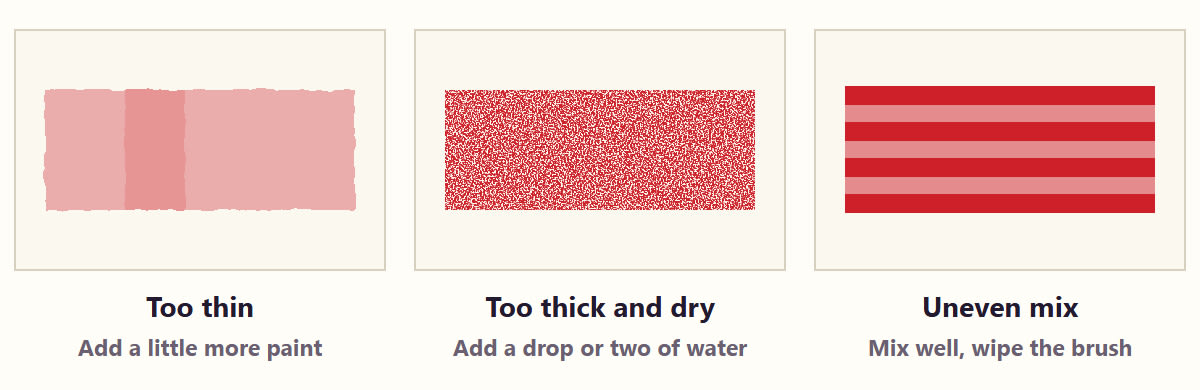
- The colour runs thin and the paper underneath shows. Cause: too much water and too little pigment. Fix: add a little more paint on the palette to thicken it.
- The brush drags on the paper and the paint forms lumps. Cause: the colour is too thick and the brush is dry. Fix: add one or two drops of clean water and mix.
- Dark and light streaks appear and the colour does not spread evenly. Cause: the mix is uneven and the wetness of the brush changes. Fix: mix well and wipe the extra water off the brush.
4. How to Fill a Flat Colour Area (Flat Wash)
When painting a poster, an emblem or a geometric design, getting a flat, even coat of colour is essential:
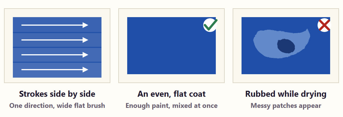
- Mix Enough: First prepare, all at once, enough paint to fill the whole area. If the paint runs out halfway and you mix it again, it may differ from the original colour.
- Brush in One Direction: With a wide flat brush, work forward with brushstrokes placed side by side, horizontally or vertically.
- Do Not Rub Drying Areas Again: Do not take the brush back over parts that are starting to dry. If you do, the drying layer underneath pulls onto the brush and leaves messy patches.
- Second Coat: Only if the coverage still seems too little after the first coat has dried completely, apply a thin second layer with good control. Applying a thick layer all at once can make the paint crack and peel as it dries.
5. Controlling Light and Dark Colours
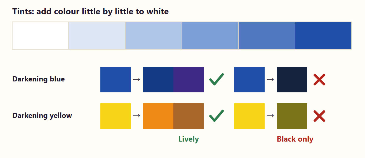
- Making Tints: Add the colour little by little to white (it is easier to add the dark colour to the light one).
- Making Shades: Avoid always using black for shadows. To darken blue use deep blue or purple, and to darken yellow use orange or brown; this gives lively dark colours. If you use black, add only a very small amount.
- The Change as It Dries: Poster colours often look slightly lighter when dry than they do when wet. So it is wise to paint an important mix on a separate strip of paper and check it once dry.
6. How to Show the Roundness of a Fruit (Three-Dimensional Form)
When painting a mango or an orange, this is how to bring out its roundness:
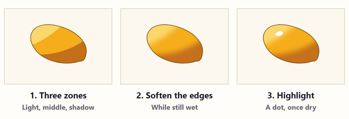
- Prepare 3 Colour Zones: On the palette, separately mix a light colour (with white) for the bright side, the main colour for the middle tone, and a dark colour for the shadow side.
- Paint in Zones: Following the shape of the fruit, apply these three zones next to one another.
- Soften the Boundaries (Wet Blending): While the colours are still wet, take a clean wet brush with the extra water wiped off, move it gently back and forth over the boundary line, and blend the edges together.
- Highlight: Once the fruit is completely dry, place a dot of white or pale yellow where the light strikes.
7. Points to Take Care Of When Working Over a Dry Layer
One advantage of poster colours is that you can paint another colour over a mistake and cover it. But there is one very important rule to remember here:
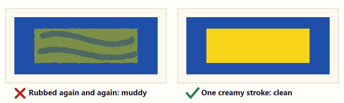
Unlike Acrylics, Poster Colours Dissolve in Water Again (Reactivates): Even when a layer of poster colour has dried, rubbing a wet brush over it again and again dissolves the layer underneath and mixes it with the layer on top.
So when covering a mistake:
- Let the layer underneath dry well.
- Do not add much water to the colour on top. Apply it at a controlled, creamy thickness with a single brushstroke.
8. 5 Beginning Steps for Practice
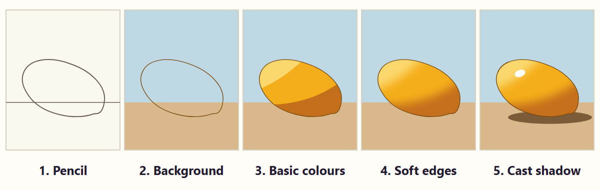
1. Pencil Outline: Place a simple fruit (a mango or a lime) on a table and sketch it with a light pencil line.
2. Finish the Background First: Colour the background and the table top first with a flat wash, and let it dry.
3. Place the Basic Colours: Decide the light and shadow areas of the fruit and colour those zones.
4. Soften the Edges: With a wet brush, soften where needed to bring out the roundness.
5. Cast Shadow: To show the fruit resting firmly on the table, mark the shadow falling on the table under the fruit in a dark colour.
Success with poster colours depends not on rubbing freely with the brush, but on keeping the thickness of the mix right and building layers with patience!